Crafting a new streaming service to unravel mental health stigma
Type
Web app, SaaS
Status
Released
Timeframe
August 2022 - March 2023
At a glance
My contribution
Participated in vision workshop
Led UX audit of existing experience
Led the definition of new IA
Worked to develop wireframes and key screens
Created test ready prototypes
Planned and conducted usability testing
The team
Creative Developer
Product Designer
Creative Director
Product Manager
Head of Product Strategy
Ashia is a video-on-demand service that shares real-world stories to provide inspired guidance for wellbeing. The product is priced for businesses and individual users. Ashia was already a live product, with a tiny user base. As an early iteration, the platform lacked polish, with basic branding, a limited content library, and disjointed user flows.
Challenges
The product elicited mixed reactions from users, with certain features unexpectedly polarising opinions. We realised that addressing wellbeing diagnosis and providing guidance for further assistance would require delicate handling and thoughtful consideration.
Outcomes
100%+
Increase in session length
By redesigning the platform's foundation and focusing on four key touch-points, we created an accessible and memorable experience that doubled user session length. The new design gave the Ashia team great pride in their product, and the app received ORHCA Accreditation.
The plan: Take an idea that could make a real change in people's lives, and make it accessible with a clear brand and intuitive user experience
Our two-day vision workshop gave us time with the Ashia team to understand the principles of the product and where it could go next. The origins of the product and the stories behind the founders offered a glimpse into the significance of the problem space.
We explored the value proposition of wellbeing storytelling and how it could be evolved to become a success in the market. As a priority, the team at Ashia wanted to be able to champion their model through a reimagined brand and intuitive user experience. The aim was to use the refined experience to convince foundation customers of the proposition.

The time spent retracing the steps of the business and product value led to a moment of clarity, where we were able to describe the impact of the experience as “Guided inspiration for Wellbeing”.
To craft an evolution of the experience, we first wanted to spend time understanding what the first iteration of the platform was achieving. Although the angle of wellbeing storytelling was being surfaced, the product was falling down most significantly through abstract content labelling, unclear wayfinding, and a lack of consistent design.
The biggest implication of this was the product's inability to support a clear end-to-end user journey that encouraged content discovery, consumption, and engagement.
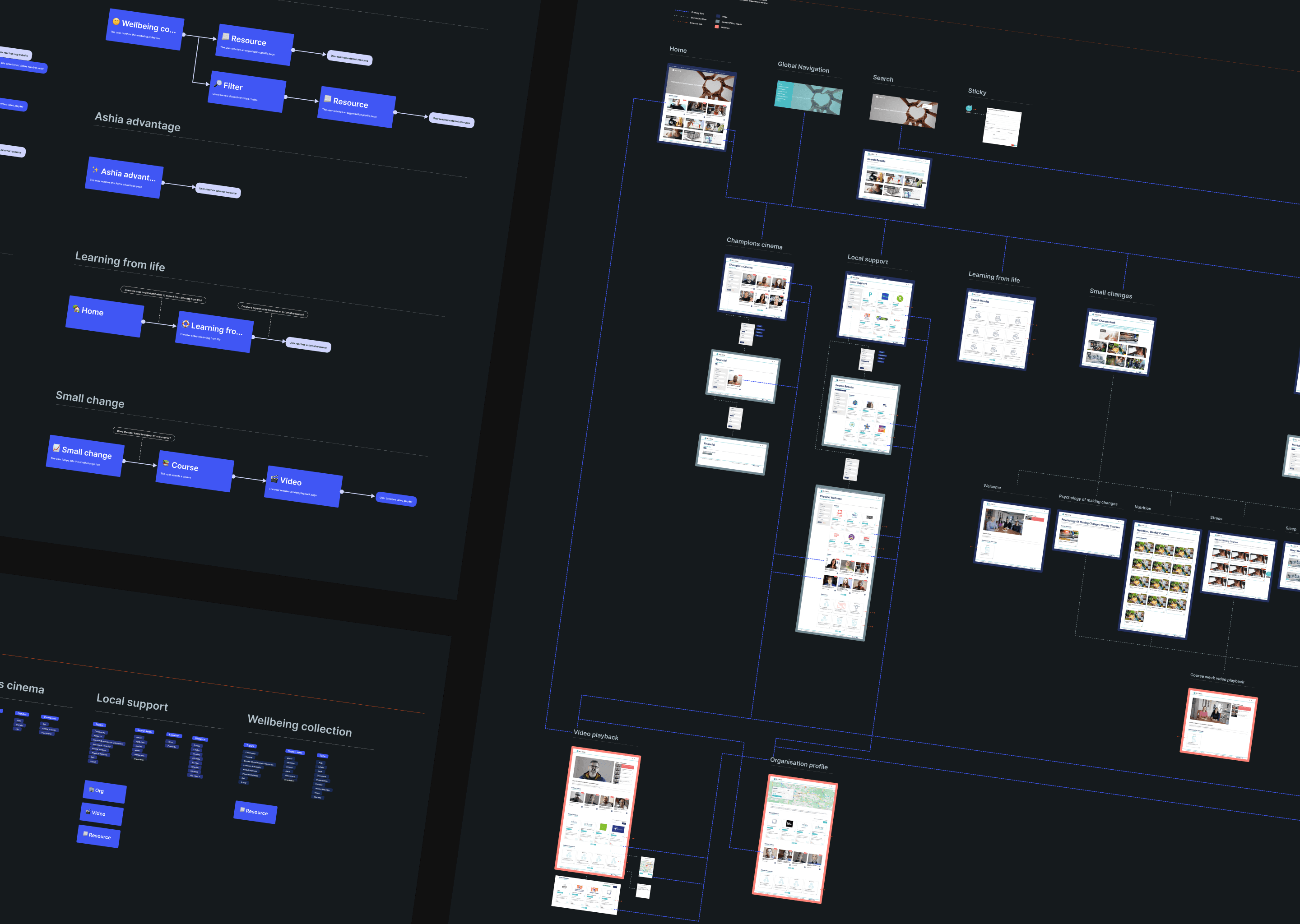
The existing product was reviewed by auditing the sitemap and the task flows that it tired to support.
After playing back the findings to the team and the client, our collective understanding was that it would make sense for a product that is based on storytelling to reflect a clear start, middle, and end in its experience.
Although personas had been touched on, the process didn't benefit from deep strategic user research. When we tested our finished designs with prospective users, the conversation often turned towards attitudes, contexts, and ethics. I believe that starting the project by talking to users on these grounds could have led to different outcomes.
Pivoting design by user milestones
At this point in the project, we had a sense of what the product could ultimately become. In five years, as a video-on-demand service, the mental health stigma could be unraveled and users could share their advocacy for having a place to explore their wellbeing.
To start this journey, a new IA was constructed around the integration of four key phases into the experience. From onboarding, the user would be informed of the key benefits of storytelling for their wellbeing. This would encourage discovery in relation to the issues they self-recognised from onboarding. After utilising content, they would be able to engage by adjusting playlists, saving favourites, and upvoting.
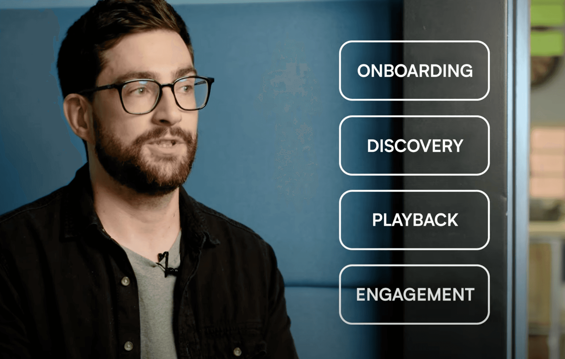
In this case study video, I briefly touch on the intended user journey and the client shares their feedback
Building a test ready prototype
The objective of the new brand and UI was to create a look and feel that didn't overwhelm and created a sense of security and reassurance. The design was founded on familiarity with other platforms, a comforting colour palette, and the use of soft animation.

We didn’t expect the experience to divide opinion as much as it did in testing—there was an opportunity to iterate further and lead on these issues
Testing a product that aims to challenge some very tough issues led us to appreciate that the problem to solve would take many iterations of design to address effectively. All five participants took us through what a well-considered mental health platform should do for them. Within this feedback, we identified four polarising issues that would potentially make or break the experience for them.
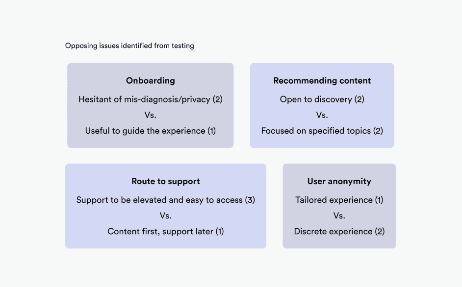
At the time, talking to users showed that the product did benefit from a redefined structure and brand, but we also had a long road ahead in learning how the product should behave in leading users to self-treat their wellbeing.
Outcomes
Based on the feedback from users and the client, the product was in a much better place to be able to communicate the notion of wellbeing storytelling.
Our confidence about the impact of the product peaked too early, and evaluative research exposed how delicate this domain is. With no clear right or wrong way to approach certain tactics—such as onboarding, content discovery, and surfacing support—we were eager to keep the conversation and evolution of the product going.
Regardless, we left with our heads held high, as we had been able to put our skills towards something quite special.