A new app for drivers. I worked to bring the vision of a positive service station experience to life.
Type
Mobile app, first release
Status
In production
Timeframe
January 24 - September 24
For the purposes of privacy, I won’t detail all features of the app, or the business mechanics behind the product. I will however talk about how strategic research revealed our purpose for the project, and how the design looked to solve this.
At a glance
My contribution
Led explorative user research
Led stakeholder interviews
Led an opportunity mapping workshop
Carried out ORCA and IA definition
Evolved concept into full experience prototype
Worked with engineers to define story mapping
The team
Product Manager
Software Engineers
Product Designer
Head of Product Strategy
Creative Director
Head of Engineering
Our client had been observing the motorway service station experience for a long time. Their idea of how this could be improved, with an uplift for their own business, was to digitise the experience of finding a service station. Once there, users would be able to exchange points for discounts with retail brands. Our task was to take this vision through strategic research and refinement, with a view to constructing a first release.
By the close of this account of the project, we were close to soft launch and had built a belief amongst all involved that we were building a product that could elevate the motorway experience for users while reaching a positive outcome for the business.
71%
Of motorists use service stations
Challenges
Late in the project, we faced a challenge to implement gamification on a larger scale. Our user research indicated this could be counterproductive to user needs. After voicing our concerns, we reached a compromise with a scaled-back gamification element.
Outcomes
As for a long term outcome for the product, it is clear that the experience should enable drivers to be informed about where they stop and make them feel positive for doing so. To measure this, we can monitor key performance indicators such as service station visits per user and incentives redeemed per visit. Reaching just a fraction of the 71% of motorists using service stations and impacting their perspective would be a success.
The plan: Take an ambitious idea, explore its fit with users, recognise opportunities, and launch an app that could impact motorway journeys for the better.
The vision workshop and stakeholder interviews clarified the potential impact for the business, set out how the practical elements of the product could work, and laid out assumptions about the value that users would receive. Having established this, we wanted to talk to users about their contexts and needs.
This was a critical moment for the project. Was there a place for this solution? Could we trace a path between the business objective and the expectation of the user?
We recruited only those who regularly made motorway service station visits due to their family, work, or leisurely purpose of travel. We engaged them by establishing an account of why they stop, what they do during their stop, and how they felt about doing this.
The outcomes were polarising in a number of ways. Notably, the perception of the current experience was split drastically. Users could actively be avoiding service stations, even celebrating when they didn't make a stop on their journey. On the contrary, we heard an account of a user who looked forward to relaxing and unwinding at a stop.
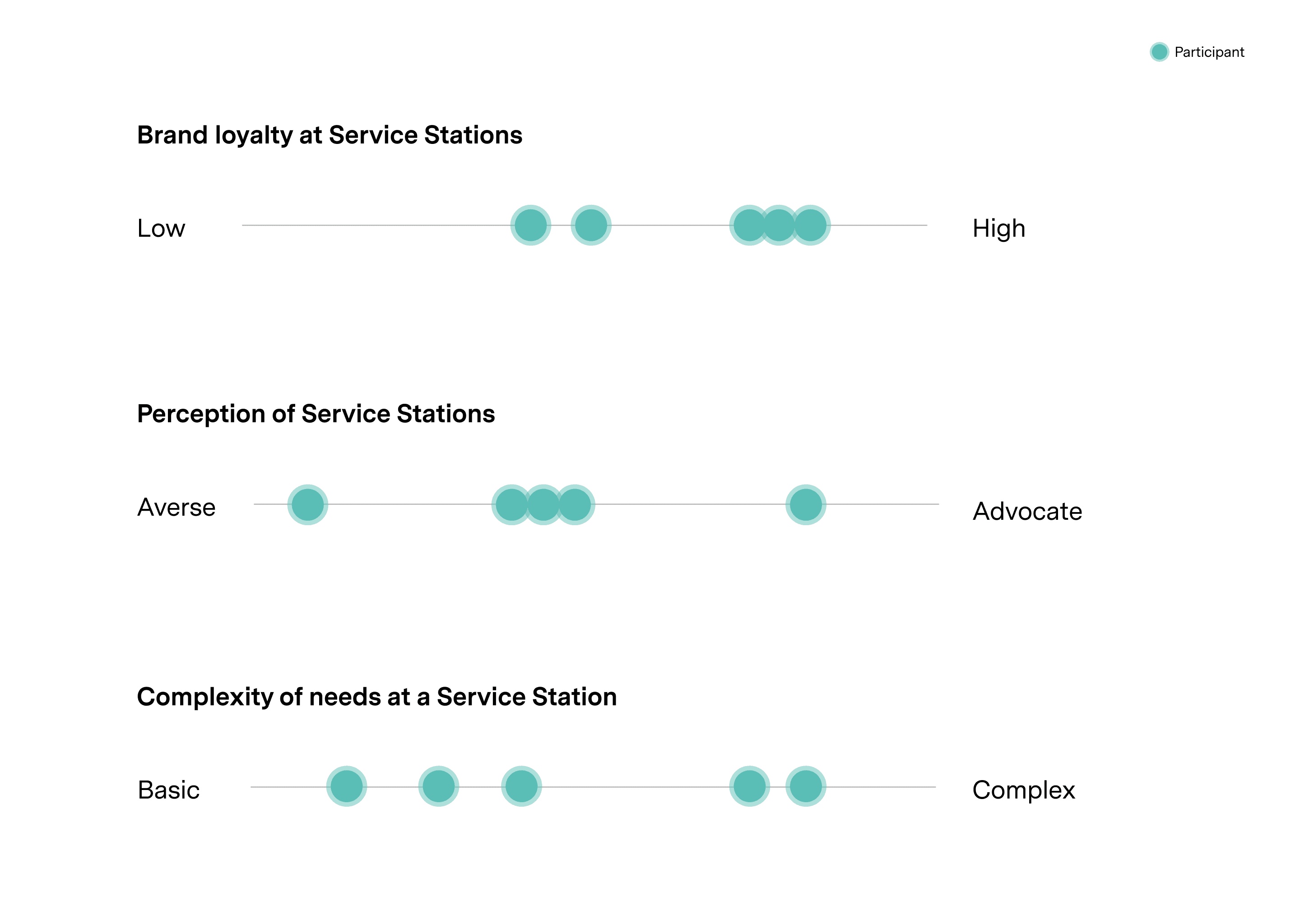
The three core variables that helped define user archetypes
The app would make sense for our users pain points, even if they didn’t actually like service stations.
Advocate of a service station or not, users were still indicating that their was a problem that could be solved through the scope of what had been visioned so far.
It was now up to us to decide how to focus the first release. We narrowed down the user problems we would want to design for. This was based on how well we determined they could fit with the product vision and the expected volume of users with those behaviours based on data gathered by the client. This way of thinking was set up to give the product the best chance of achieving scale and retention.
With a window of suitable problems to approach first, we surfaced opportunities and explored their requirements, risks, and things to learn. This gave us the context to vote on and shortlist features into a first release.

Mapping opportunities, with reference to the current experience including user interview snapshots
At the start of the project, we had created a proof of concept with a number of screens designed to high fidelity. We were eager to take these concepts and apply as much critical thinking as possible to align the vision with the context of the user and the business.
To do this, we defined the structure that needed to support the experience. All of the concepts that would support the first release were drawn together in a ‘core loop’ system model to understand how they would need to relate to each other for the experience to deliver value.
Cementing the ‘core loop’ would give us the best chance of being able to integrate features to build user delight in future releases.
This was the first step in taking the draft into something that could work in reality. We also understood what key interactions were missing and what details needed to be clarified up front. By asking these detail-oriented questions before prototyping, we would save ourselves countless hours of rework.

Creating a core loop that brings the prioritised concepts into a cohesive system
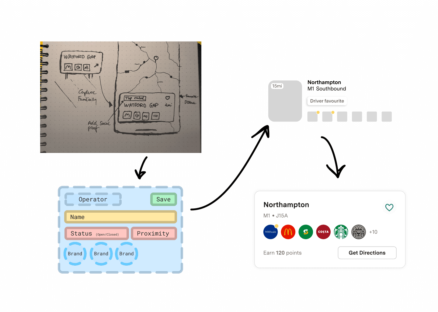
Digitising motorway service wayfinding
During our time talking to users, we picked up on a common pattern. While driving, users would make split second decisions to stop based on the brands they identified on motorway signage. These signs are often hard to make out and poorly interpreted. There was an opportunity here to transition users to an improved version of what they were familiar with.
By mimicking the real world counter part, we would be surfacing a point of familiarity for users to grasp before diving into the digital structure of a service station. We also knew from user research that signposting available brands alongside such attributes as proximity could give users the ability to make quick decisions.
Design process: from vision, to structure, to UI design
For first release this experience is suitable for ‘pre-planning’ journeys. For this to evolve to become a solution to inform drivers while they are behind the wheel, other methods of delivery need to be explored, such as voice assistants.
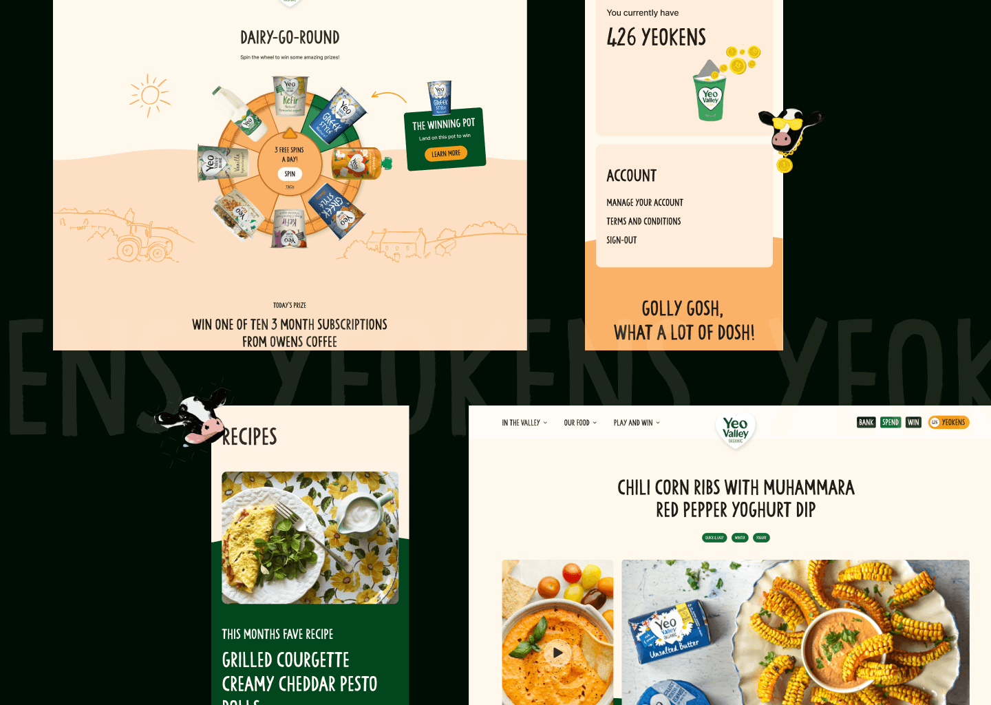
Late on in the project, the client wanted to gamify the experience as much as possible. We needed to sanity check this against user research and protect the core value of the app.
Very late on in the design process, the client raised their belief that the first release of the app should push gamification to improve the chances of app retention.
When we asked users about their ideal experience, gamification wasn’t a high priority. Users cited convenience and value factors more than anything. We referred back to this when shortlisting gamification tactics—and suggested nuanced rewards to reduce friction (i.e. a gift for stopping more than once on a long journey).
Despite this, gamification was generalised for the first release and relied on peer to peer performance (leaderboards). As we didn’t have complete confidence in this supporting the user, we ensured that the core loop was protected and visually prioritised.

Implementing a clean adaption from light to dark mode using Figma variables
Outcome
We were successful in designing something from the ground up—but this shouldn’t be the end.
At this stage, we are all internally optimistic that the first iteration will be able to act as a useful aid for users to find and plan service stops on the motorway.
The number of user variables we identified will mean that the app might miss the mark for some people, and we will need to measure this.
There have also been a number of conflicting voices in the room, which has resulted in the need for complex user journeys outside the core app loop. While this is in production, we have earmarked the need to review this carefully with users before release.